Mochi Design System
Design System • UI • UX
Introduction
With the company’s product ecosystem growing and diversifying, multiple existing product-specific Design Systems showed its limitations in efficiency, flexibility and scalability.
Design problem
How might we design an adaptable Design System that streamlines both the design and development processes, while catering to diverse branding guidelines, and delivering a consistent experience across multiple products spanning various industries and platforms?
Outcome
Grew a comprehensive Design System of 50+ components, with successful implementation of its second version on Storybook, resulting in a 50% reduction in design time, and enabled Developers to ship quickly and more often.
Initial discovery
After studying the structure of Google’s Material Design 3, we decided as a team that it was suitable as it was:
• familiar to Designers so the learning curve is lower
• familiar to Developers so it is faster to build and implement
• flexible enough to cater to different brand guidelines
• able to provide a consistent experience on different platforms
Given that there was pressure to ship often and quickly, this fulfilled everyone’s needs. We liked the idea that Designers and Developers can easily switch between brands in seconds and prevent repetitive work. This would result in the decrease in time taken to deliver designs - which was important as we were a small team handling multiple projects at once.

First version problems
In the first version of the Design System, it consisted of both components and tokens that were specific to the product I was working on at that time. This meant that other Designers working on other products had to retrofit the components into their designs. Initially, we thought that it would speed up delivery, but it still took time and effort to edit the components to match their respective product and brand guidelines.

Structure
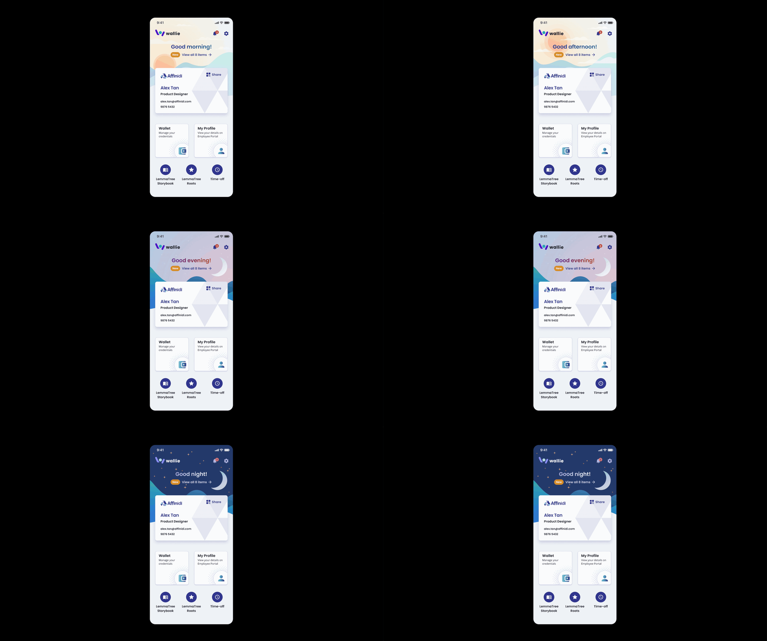
To ensure the entire Design System was flexible enough to easily switch between products, it was essential to separate the components and tokens.
• Each product would have their respective tokens that are unique to the brand i.e. colours, gradients, effects, typography and grid.
• All products would share the same base components that would be generic enough for use across all products, i.e. buttons, navigation, modals, with the exception of a few product-specific components.
Merging Design Systems
I collaborated with the Design team to merge all our separated product-specific Design Systems into 1. We collectively agreed and committed time on top of daily work to set this up as we believed that this effort would really help us.
Introducing Design System version 2: mochiDS.
Delicious design - Versatile, Sticky & Delightful.
It’s flexible and scalable, and can cater to multiple products, on various platforms with different branding.

Balancing the principles—Versatile, Sticky, and Delightful—within mochiDS involved a focused approach. We ensured components were adaptable (Versatile) across platforms while being intuitive (Sticky) for easy adoption. We also prioritised Delightful interactions, infusing joy into the experience and design process. On top of that, continuous collaboration and iterations ensured a cohesive system.

Next steps
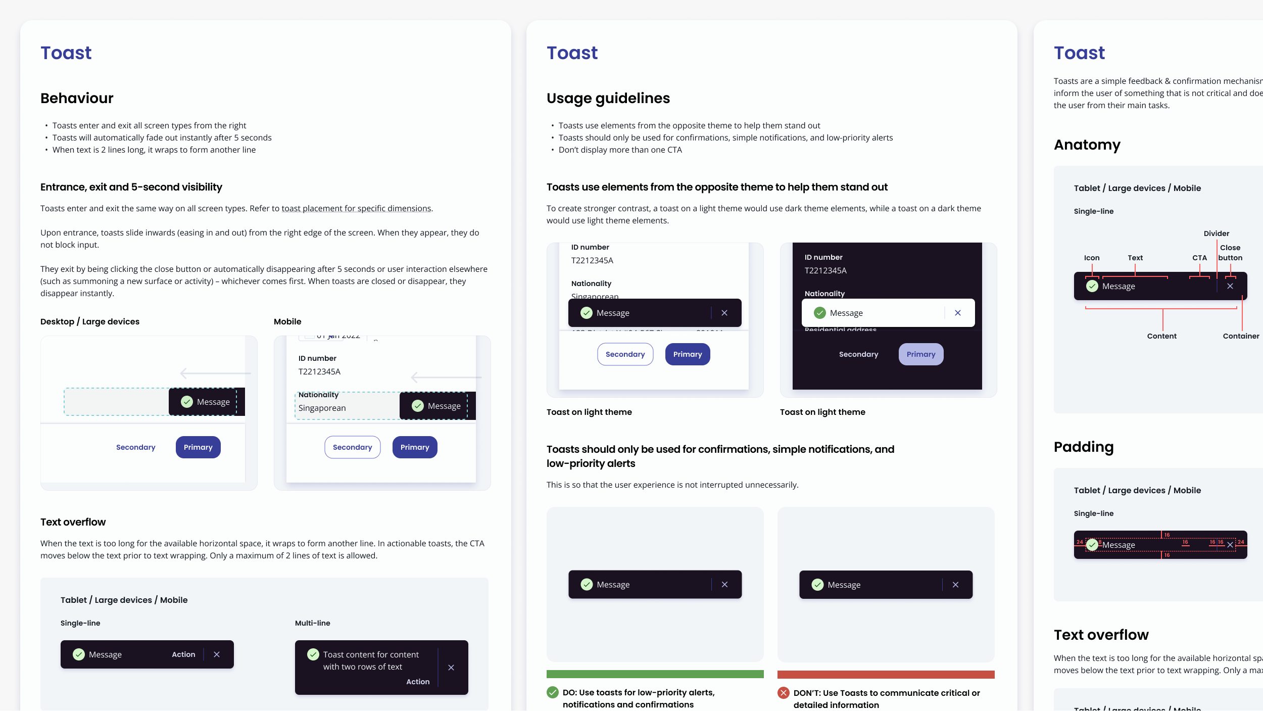
1) Documentation: I worked on providing documentation and usage guidelines for each component. This was to guide other designers and Developers on how to use and implement them. It included clear insights into interactions, paddings, and other critical details, minimising errors and the need for back-and-forth communication.

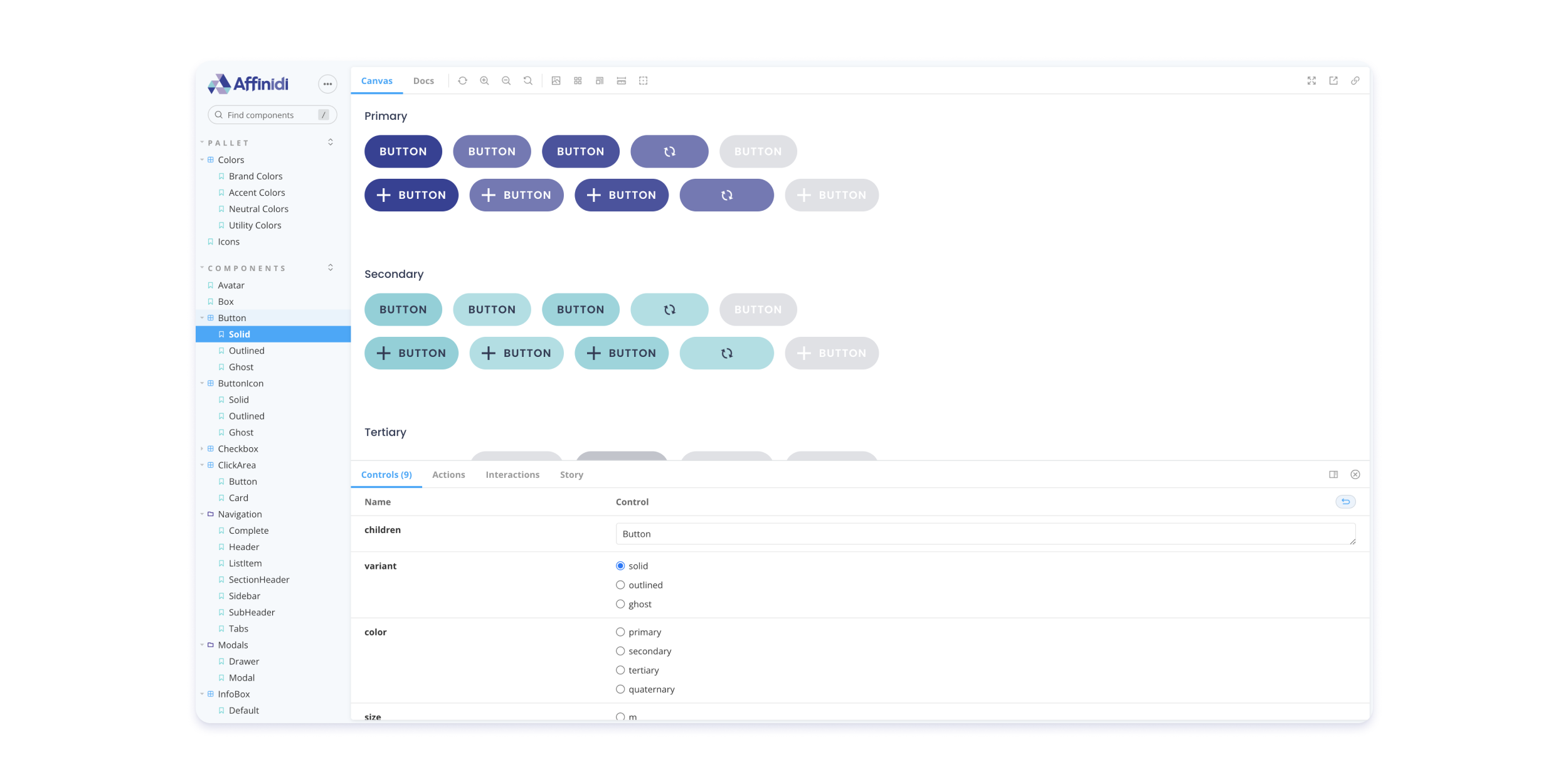
2) Implementation: I worked alongside Developers to ensure all their questions are answered and review components on a library level before they’re used in products. Naming conventions were also discussed to make sure they were of industry standard. This made implementation faster and easier for newly hired Developers to be onboarded.
3) Iteration: As products went through rounds of research, we gathered feedback and made edits to components where required. We would then go through the same review and implementation process.
Collaborating with Engineers and Designers through a weekly peer review process for each component from design to implementation, reduced errors in implementation, fostered consistency, and informed other designers about the availability of new components they could use for their own projects. In turn, this helped maintain the overall quality and usability of the Design System.
Results
Version 2 of the Design System grew to over 50 components and decreased time to design by 50% as compared to version 1. It required less time and effort to stay ahead of development, which gave us more time to focus on the quality of design and experience for users.
What I learned
• Importance of dog fooding: to ensure the quality of the Design System, all designers can play a part by testing components and giving feedback. Be your own customer - it’s the fastest way to learn and improve.
• There are many ways to structure a Design System: as long as it is agreed, tested, and easily understood by everyone involved with the help of clear documentation, it’ll work.
• Taking time to plan at the start is worth every second: Planning structure, naming conventions, and processes at the start saves the back and forth later and ensures consistency and scalability.